4.19.2010

Cosmic Hearse


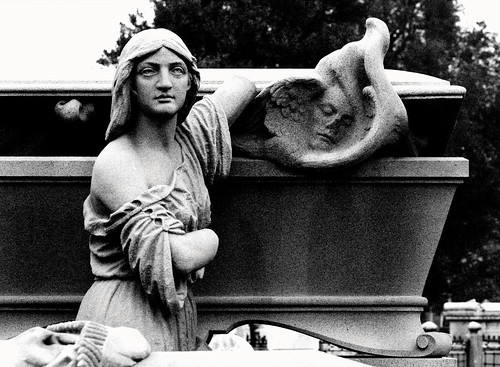
So, as I mentioned a few posts ago my favorite historic site (it is actually technically a National Historic Landmark) in all of historic Philadelphia is Laurel Hill Cemetery, and in honor of their 175th Anniversary they are putting out a publication and accepting submissions of artwork and writing. I highly recommend the tours and programs at Laurel Hill. In addition to being full of cool monuments, it's situated along the Schuykill River which is probably the prettiest spot in Philly, is the resting place of many famous Philadelphians and has a few noteworthy and strange graves like one with a glass viewing window along the top, the movie prop grave of the character Adrian Balboa from Rocky Balboa (as a permanent fixture), a really amazing and famous one designed by Alexander Calder and my favorite grave that of Mrs. Catherine Drinkhouse Smith and her husband Professor Levi Franklin Smith who were both victorian spiritualists (and she was a medium!)

Anyway, this is my submission. The wreath is actually my favorite part and based mostly on victorian mourning art, hair jewelry and design. The center image is taken from a photograph I took at the cemetery recently, when I went on an exceptionally good, very long tour where they let us into a crypt! I'm pretty pleased with the whole thing, especially the wreath (I'm particularly into the mourning brooch), and it was really fun to be painting in full color again. I had wanted to do something a little more ambitious but I only had ten days to finish. I have some ideas for ways to frame the original which I might sell at some later point.

here are a few close ups:

As a side note, another really interesting (if you are a morbid creep like me) related place in Philadelphia is the Museum of Mourning Art which I visited and really liked. It's small but they have a really good collection of mourning jewelry, including one made from Abraham Lincoln's hair!

Paging Dr. Herbert West

So, I finally finished that Women record. It took way longer than it should have, mostly because I was dragging my feet and wildly distracted by the weather. I'm pretty pleased with how it came out. I used Microns to ink it instead of the brush I usually use, and while I definitely prefer the way my brush lines look, I needed to use pens for this because it was so much work and I drew it at such a large scale and pens are much faster (and reproduce a little better). I also used Photoshop, which I hate, to add the color because I understand that a true solid color reproduces much better in limited color printing, and I wanted to make things easier in that respect. I'm the first to admit when I'm being a stubborn cavewoman, and I can see how using photoshop for a few things can make it way more usable and printable. But man, I feel so much better when I'm actually painting something with my hands, and I feel like everything I personally do looks better when done by hand.
I'm actually really excited about how the back cover came out design wise and once again was excited to draw those tails.
I'm also pretty pleased with the lettering, which was basically what I did on the labels. It's supposed to look hairy. I really like doing hand lettering, though it can be frustrating and there's lots of room for stupid and hard to correct misspellings and errors (zack's "birtday" card is a very good example of this haha)

And here's a close up of a screaming rat face!
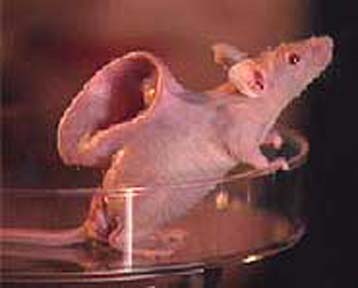
Oh and a word about the theme: after a lot of back and forth and changes of ideas the band wanted to do something Re-animator themed, with a dead rat and a syringe full of the green reanimation fluid (though I think the rat is actually from Beyond Re-animator) . I was delighted because I like rats and drawing rats (and anything gross with a million tiny hairs) and I love horror movies. The back cover and the labels were sort of vaguely rat king related. The sewn together rats on the front were an idea I had that came from a couple sources. Inspired in part by the mouse with a human ear grown on it, in part by the death of Chang and Eng, and also by an account in Stiff by Mary Roach, in which she describes a series of experiments where the head of a dead dog was transplanted onto a living dog and supplied oxygenated blood before brain death could occur. The transplanted head lived (for a couple days or weeks in different instances) an obviously tragic and confused existence on the live dog, and they occasionally even bit each other. Aside from that being an incredibly cruel account of Mengele-esque animal torture, it's a really good example of modern science falling squarely in line with true mad science. That is definitely an experiment Dr. Herbert West would have done.

I got started on the the Laurel Hill project immediately after finishing this one. It's basically a race against time at this point! 10 days to finish!!!

4.07.2010

Return of the Rat (oh no no no no no no no)

Hey guys!

I know I haven't updated in a while, but don't think I haven't been doing SOMEthing. Right now I'm concentrating on one piece at a time, but like I said before took on waaay too much (for someone with a full time job). Anyway, I dont usually post photos or works in progress, but I wanted to make an update, and this cover is basically done. Something about it is bothering me though, and I thought I'd take a few days and get some distance to figure out how I can adjust it. Also all the lettering will be solid puke green when I'm done.
Drawing these rats (and feeding pizza crust to one in Rittenhouse Park last week) forced me to think a little more about their anatomy as you can see in this closeup. The hand on the left was my loose understanding of what a rat hand looks like, and the hand on the right is the one I drew after reference. I'm going to have to go in with white to fix the first one.
Also, I have always accepted the cartoonist shorthand for "rat tail" as seen in the simpler label rats of my previous post. It occurred to me for the first time that I wasn't actually clear what those horizontal segmented lines were mimicking and a closer look at a rat tail revealed teeny tiny scaled skin, not in any way broken into segments (which almost seem like a simplification of scales that look more like armadillo plates). What I settled on for my rats was actually a hybrid of the imaginary segments and the tiny scales, and the tails ended up being my favorite part of the whole drawing. While I do think working from your imagination is very important sometimes a little glimpse at the reality of nature reveals something way cooler that you can then build on.
Also of note I donated a piece to this which is opening tonight:
It's the framed original of the Bones of Sea Birds Cassette cover I did for Peasant Magik. You will notice there is no moon in the original. That was actually added on the computer at the musician's request.

Speaking of Peasant Magik, my friend Denis recently started a great blog where he photographs and interviews friends about their music and art and process. His first interview was actually with Sal about Peasant Magik records. While I often tell Sal that he is the grossest person I know, I rarely tell him that he is also one of the most inspiring (I don't want him to get a big head). He puts so much care and effort into every one of his releases and I have spent many a night folding and cutting covers with him and left knowing he had days and days of the same ahead. Check out Denis' interview and photos here: http://dissolvingintogray.blogspot.com/ (it will also be cross posted at http://nevernothing.com -another friends' photography site) and keep an eye on his blog for more interviews with a lot of the people who I show and hang out with here in Philly!

3.17.2010

r-a-t-t

So I started working on some album art for a Philly band, Women. It all has a sort of...mad science Reanimator theme, and what it amounts to is a LOT of drawings of rats and green fluid. So far I finished the labels. The live rat is A and the dead rat is B. I still have a lot of work to do on it.


I'll basically be working on the Women record for the next few weeks but I'm trying to work as hard as possible to get it done in time to do the Laurel Hill thing. Also of note, one of my birthday presents from mike was a magnifying light:
I tried it out last week and holy shit...it makes those insanely small details so much easier and makes some really ridiculously small things possible. Of course it's slightly maddening to see my lines under it, looking so inconsistent and imperfect but always relieving to pull the magnifyer away and watch all the flaws disappear...also, man...are my fingernails dirty it turns out...

If you live in NY (or will be there soon) you should REALLY go see Tamara's show. It opens tonight and it looks amazing. Basically everything I've seen of hers is really cool and mindblowing, and she's an awesome multi-talented lady!

3.09.2010

Life is Short and Full of Stuff, so Let Me Know Baby When You've Had Enough!

heyyyyyyyyyy hey. After a week and a half of stupid "drawing" block and procrastination angst, I got a bunch of ideas and committed to possibly too many projects for the next two months. One of the things I was struggling with for some reason was thinking of an idea for a shirt design for my friend Carol's store, Toilet Water. It's absolutely stupid when you are given free reign to do whatever you want and your mind goes completely blank of (appropriate) ideas. After cruddy weather forced me to take the subway one morning all the sitting and waiting and walking resulted in a mini brainstorm. I decided to do a memento mori inspired design with lettering spelled in hair as a slight reference to mourning jewelry. I include a couple of close ups here since the blog format reduces the whole design so much:

The "Too Bad You're Gonna Die" phrase is actually lifted from a Cramps record, with the grammar corrected so that Carol wouldn't have to hear about it from anyone. Though I actually really prefer it with the incorrect grammar. I particularly like this phrase because it's kind of an obnoxious snarky reduction of memento mori.

On the same topic, shortly after I got to work with my idea for Carol's shirt already decided on, I read that Laurel Hill Cemetery is producing a publication for their 175th anniversary and they are accepting art submissions! I'm thinking about submitting something, because I'm a big fan of the cemetery (and cemeteries, and funeral iconography and mourning practice) and a lot of their tours and public programs. I'm thinking of working on a design that incorporates the braided hair lettering and one of the more famous monuments from the cemetery with a gravestone poem (probably culled from the hundreds of pictures I have from cemetery trips). Hopefully I can get something finished by the submission date and hopefully if I do it gets selected! It would be really cool. In the mean time I'm working on a record cover and some illustrations for a friends viking rpg manual, and as always working full time and hoping to occasionally see the outside.

In OTHER news, check out Mike's New Blog, which is completely devoted to his obsession with madballs, fake madballs, and assorted other monster balls (yes, I know that's funny). He's a wonderful weirdo. He's also been working on designing some of his own madballs, and will soon start posting those along with madballs designs by other artist friends, including me of course! Also I drew the header logo!

2.24.2010

heart attack!

Pictures of the 2010 heart show that my ouija board piece was in are up, if you want to see some of the other work!

http://www.theheartshow.org/

2.23.2010

When the Rain Comes Down, Would You Choose to Walk or Stay?

hey hey,

First of all you may have noticed my fancy new blog header. I've been meaning to make something specifically for my blog for a long time but really didn't have time between other projects. So last week I just made time. It was really fun designing and making something just for myself and I think the actual painting itself came out really nicely. I realized when photographing my heart show piece that a lot things that get lost in scans (like all the tiny linework) come out a lot better in photos so here are a couple of the painting I used to make my header:


In other news, I got some pin sets made from some of my fun-a-day paintings, since they were already in a perfect round format. Just the four cryptids: nessie, the mothman, the yeti and the chupacabra. I learned a few things about what looks good in pin format, and found a great place to have small quantities made (http://smallworldbuttons.bigcartel.com/). This lady is super fast and the pins look really nice and she offers the 1.25" size I prefer! I will probably work on designing some art specifically for a button set next. In the mean time though, here are these guys, a 4 button set of 1.25" buttons, $5 a set (including shipping) if you're interested! Contact me through email and I can take shipping info and direct you towards my paypal.


In OLLLLLD news I finally got a full scan of that ST drawing I did last year and cleaned it up on photoshop. Inspired by the song "suicidal failure" and the many excellent hand drawn ST shirts on the cover of the self titled record which is probably one of my lifetime most listened to records:


I may sell prints of this if there's sufficient interest. I mostly made it to amuse myself with the hope that I would one day get around to screening it on the back of a white button up so I'm not sure how desirable it is to other people.

I have a bunch of cool projects to work on coming up and as always I'm struggling to work 40 hours a week and finish art projects and just maybe sort of have a life. It's been snowing (and now raining) like crazy which helps me explain away the fact that I spend pretty much my entire life indoors. I've been really into 80's and early 90's goth and deathrock lately, so I leave you with links to a bunch of that, assuming that like me you would like to wallow in the gloom of late winter! Two Witches, X-Mal Deutschland, 45 Grave, Skeletal Family, Bone Orchard, Ghost Dance, Sisters of Mercy and Christian Death!

2.10.2010

Mystifying Oracle


Here's my piece for the aforementioned Heart Show. It's a heart shaped Ouija board with a heart shaped planchette that Josh Robeson cut and assembled for me (did I mention he can make anything?). All painted in the usual Pelikan Plaka and now a new Speedball liquid acrylic I picked up recently and really like. While the board isn't technically functional with the planchette, due to the constrictions of the show's theme, the planchette is pretty use-able on it's own (aside from the fact that you'd be putting your grubby fingers on a painting). I've been wanting to design a Ouija board for a while and took this opportunity to make a first attempt. I still want to make a full sized and functional one some day.

Here's the info for the Heart Show, there are a ton of really neat people participating!

Saturday Feb 13th: 3-9pm
and
Sunday Feb 14th: 12-4pm

@STORAGE
1414 S Darien St.
Philly, PA 19147

Also this weekend is the Fun-a-Day show. Because of conflicts with the Heart show I (and my work) will most likely only be there Friday night, but come check it out if you like seeing paintings of tiny creeps.
February 12 and 13, 2010, 7-10 pm at Studio 34
4522 Baltimore Avenue, Philadelphia, PA 19143
Reading Event February 13, 4-6 pm

You might also want to take a look at Mike's work for the show. It's ridiculous and awesome. Here's the card he made for his project:


PS- check out my giant tarantula ring in the planchette picture! a birthday present from Mike. Made by this etsy seller whose shop I obviously frequent (animal skull jewelry? YES)

2.01.2010

Fun-A-Day Week 3! Finished!

The last week of fun-a-days is finished! Note godzilla and king kong are larger (heehee "to scale") also the toxic mutant glows in the dark! I took a few pictures of them framed to give a sense of the scale. These guys are tiny!


1.27.2010

Fat Jackals Howl at the Moon

Totally unrelated to everything except what I'm generally preoccupied by today but ohhh my godddddddd:


I love that.....

Only 5 fun-a-days left! the first few from this next batch are probably my favorite. I'll post them at the end of the week sometime!

Next up is the heart show. Unfortunately because of my work (meaning boring paying job) schedule I'm pretty much doing projects back to back most of the time, without a lot of time for sketching or fooling around, but I'm excited about my idea (heartshaped ouija board and a heartshaped planchet!) and hopefully with an extra day off of work it'll all get finished in time!